essingtonblue
Roofer
Shirt collars on football shirts are always a no no, always look awful.
Round or plain V only.
Round or plain V only.
I would not be very surprised if we had a new badge in the next few years. There's a general shift towards two-colour simplified images which are easier to use in digital platforms. Norwich changed theirs recently as did the Premier League a couple of seasons ago. I just hope they contact Smit if they change ours, he'd do something iconic.Thats a crime to the best badge in the land.
The man in it has helped play a trick on your eyes micky.
Wortho looks right mardy in that pic
No.We're you at Trent Bridge today Wints?
Thought I saw you on the Tele. Obviously mistaken.
100 millionHow much are FBS paying? The shirts remind me of an old Brum one.
I was watching the Test match on Sky yesterday and saw a fan with a Walkers crisps City shirt on.
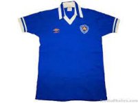
This.There's a strong nod to the 79-83 umbro kit which is the greatest Leicester City kit ever.
That said the club badge and Adidas logo in gold really don't work.
The Thais always want to incorporate some gold in our kits but never quite get it right.

Change a global sponsor's corporate identity just to try and make a crappy football shirt look a bit better? Yeah right. Good idea.Changing the very basic font of the sponsor would make the world of difference to the look. Surely someone in the commercial department or someone with eyes have mentioned this, no?
